|
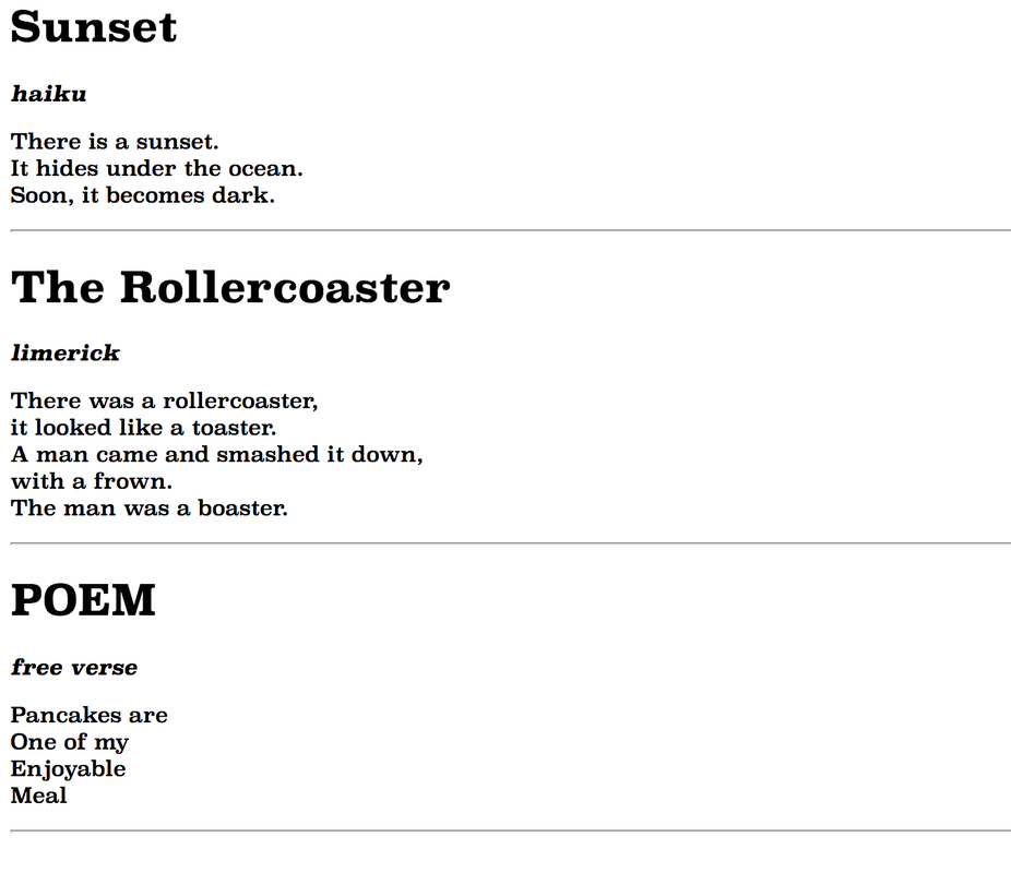
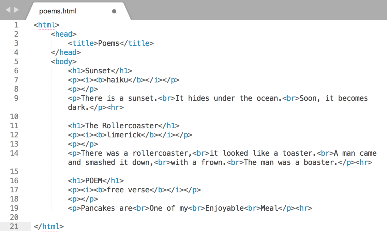
In this assignment, we were asked to vectorize our three best logos and make three different variations of each one. I think the challenge was making different variations. I think it was harding thinking about how each logo should be different. My favorite part of this assignment was choosing the colors to make different variations. I think from this experience, I learned things that really represented me by really thinking through about 15 things that represented me. 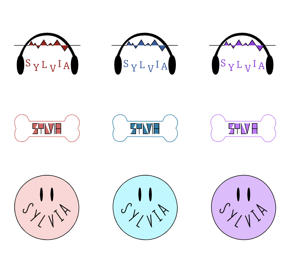 I decided to make this logo because I am mostly happy. I thought something that represented happiness most was a smiley face, so I decided to draw a smiley face. I wanted something that people knew it was me, so I put my name on the smiley face. I like this logo the most because all the other logos represent something specifically but the smiley face represents me in general. I think this logo was kind of hard to vectorize because drawing a circle and organizing my name like that was complicated. 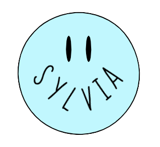 In this assignment, we were asked to write down some words that represented us and illustrated few logos along with it. The three logos that I chose were the ones that I circled. I drew the headphone logo because I like music, I drew the smiley face because I am happy, and I chose the dog bone because I like pets. It was a fun process, but at the same time it was kind of hard to think of a whole new logo that represents me. 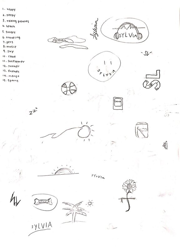 In this assignment, we were asked to draw a design and use four color schemes. We had to created four different color palettes and to do this we used Adobe Color. The four color schemes were monochromatic, analogous, complementary, and triad. Monochromatic has one hue and various saturation and brightness levels. Analogous is hues that are next to each other on the color wheel. Complementary combines hues from the opposite side of the color wheel. Triad combines three hues evenly spaced out on the color wheel. My favorite color scheme is monochromatic because I think it was easier for me to choose the colors I liked. I traced this illustration. 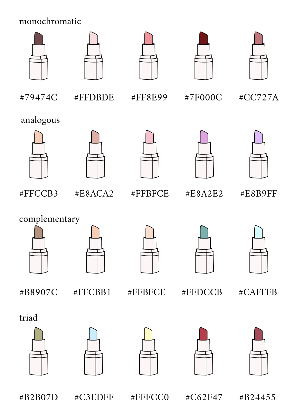 In this assignment, I traced a cat drawing. I created 15 sets of cats and filled it with 15 different colors. I was asked to create work that displays 15 different colors. First, I traced the cat and chose different colors for each cat. A challenge was tracing the cat. But, I used what I learned to draw the curves. One success was using the CRAP principles to make my work neat. I'm proud of how I traced the cat because it was how I wanted to be. I used the pen tool and the sub select. My image was based on this. 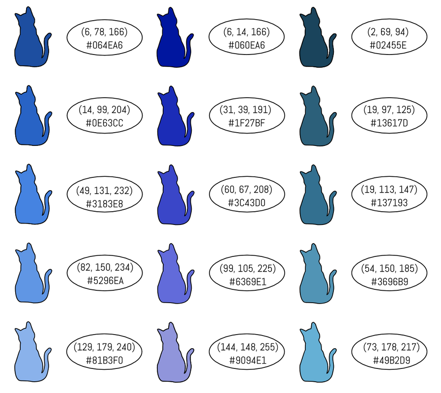 Typography is the style and appearances of printed matter. Typography is important because it can represent different kind of style of words. For example, it can represent the seriousness of a word, and it can show what kind of style the person is trying to convey. The quote "each font has a personality and a purpose" means that all fonts are used differently according to their style. We learned that different fonts should be used in different purposes. We also learned about serif, san serif, monospace, script/handwritten, and display/novelty. The serif font has feet at the bottom of the letters, they are used in large amount of texts, and they are used in print. The san serif font do not have feet, they are usually used in headlines, titles, and small amount of texts, and they are used on web. The monospaced font's letters take equal amount of space, they do not work in large amount of texts, and they are used in coding. The script/handwritten font include cursive, handwriting, and calligraphy. They are often times difficult to read but they are good for logos and headlines. Lastly, the font display/novelty are good attention getters and popularity comes and goes within these fonts. Typeface ComparisonI chose a word(omg) and used them in the 5 different fonts. I labeled the name of the font and type of font I used. 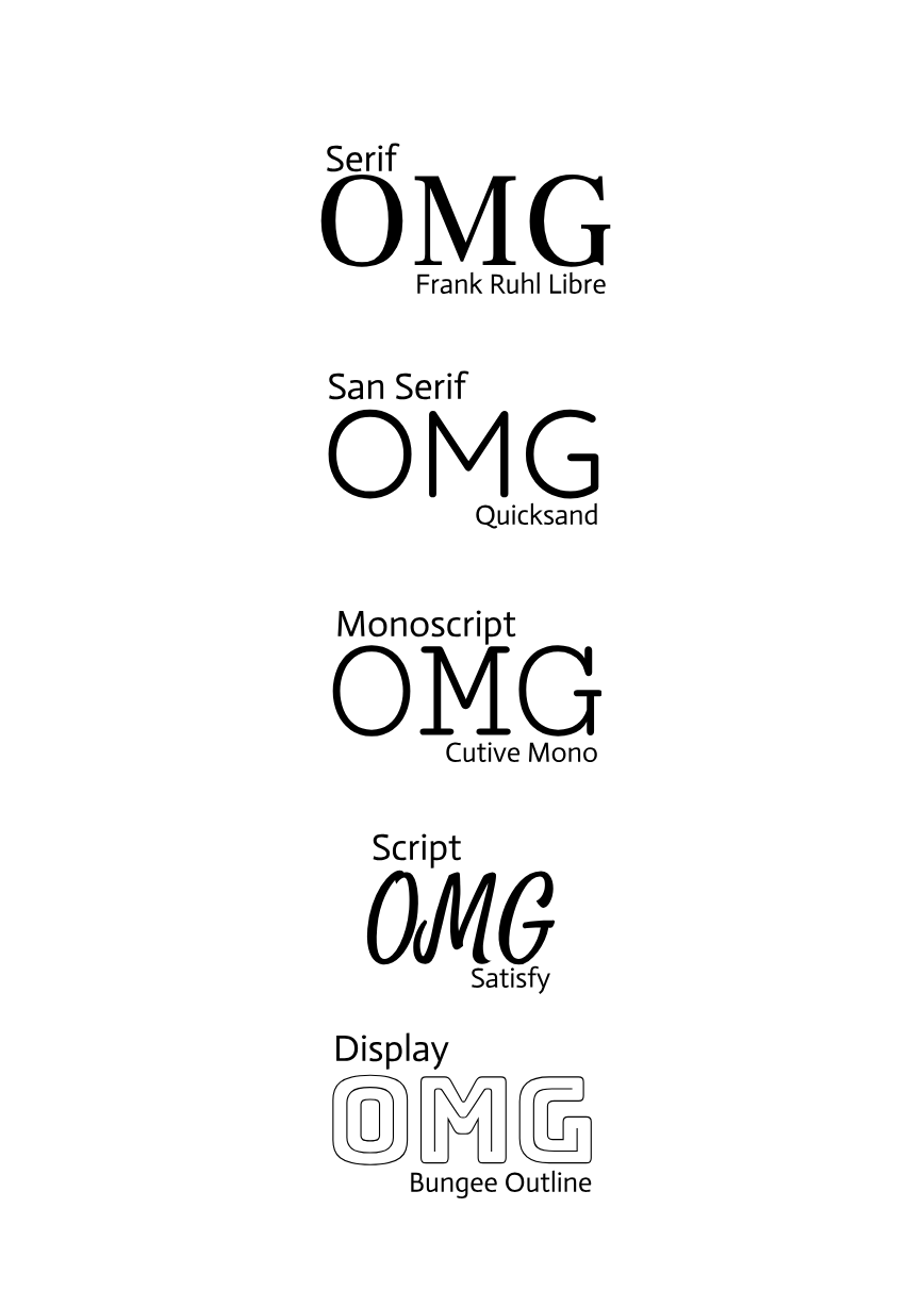 Word PortraitsI chose 10 fonts, and chose 2 words for each font. I chose one font that matched the style of the word, and one word that did not. I labeled the name of the font and I tried to apply the CRAP principles. 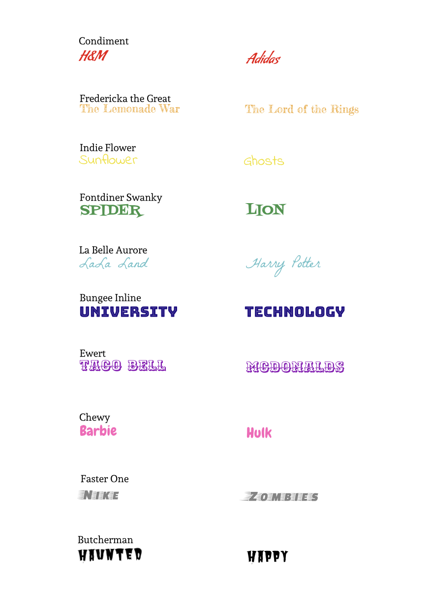 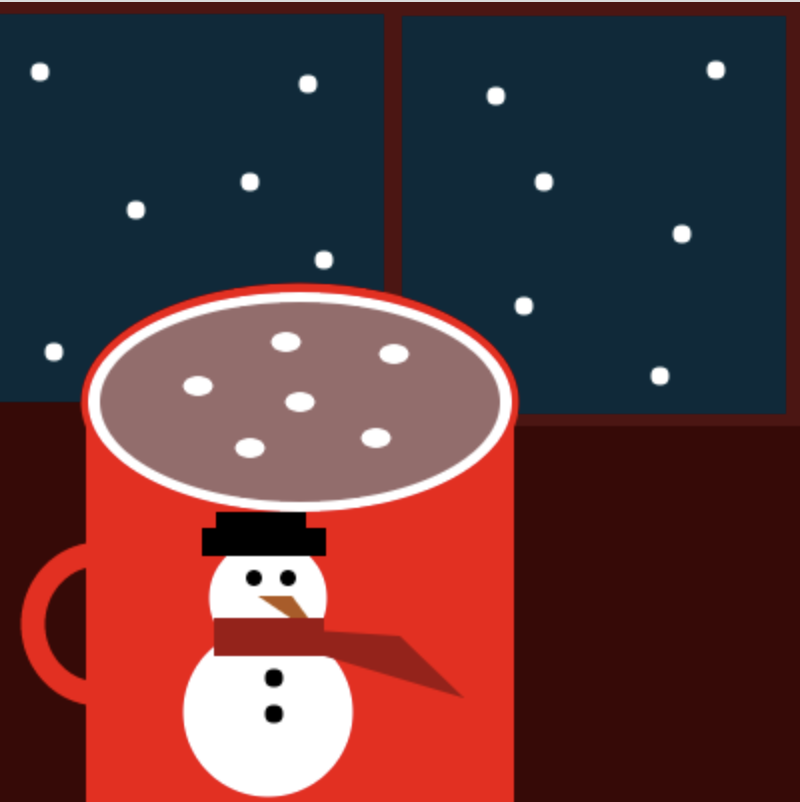 I drew a mug that has a snowman on it and it has hot chocolate in it. I drew this because this reminds me of winter. I made this by making continuos changes and seeing what looks the best. I learned that making a drawing out of code was pretty simple. It was hard to control triangles, but I looked at the documents to see what controlled what. This is my code that I used to make this:
stroke(82, 16, 16); strokeWeight(7); fill(5, 42, 59); rect(-16, 2, 211, 206); //left-up window sill fill(5, 42, 59); rect(197, 3, 199, 206); //right-up window sill noStroke(); fill(59, 5, 5); rect(197, 212, 231, 206); //ground fill(59, 5, 5); rect(-44, 200, 271, 268); //ground stroke(245, 0, 0); strokeWeight(12); fill(59, 5, 5); arc(50, 311, 67, 70, 48, 650);//mug holder noStroke(); fill(245, 0, 0); rect(43, 192, 214, 391); //mug fill(245, 0, 0); ellipse(150, 200, 219, 119); //outline of mug 1 fill(255, 255, 255); ellipse(150, 200, 212, 110); //outline of mug 2 fill(153, 107, 107); ellipse(150, 200, 200, 100); //hot chocolate fill(255, 255, 255); ellipse(150, 200, 15, 10); //marshmellows ellipse (99, 192, 15, 10); //marshmellows ellipse (188, 218, 15, 10); //marshmellows ellipse (125, 223, 15, 10); //marshmellows ellipse (197, 176, 15, 10); //marshmellows ellipse (143, 170, 15, 10); //marshmellows textSize(20); noStroke(); ellipse(20, 35, 9, 9); //snow ellipse(272, 90, 9, 9); //snow ellipse(248, 47, 9, 9); //snow ellipse(68, 104, 9, 9); //snow ellipse(330, 187, 9, 9); //snow ellipse(341, 116, 9, 9); //snow ellipse(125, 90, 9, 9); //snow ellipse(154, 41, 9, 9); //snow ellipse(262, 152, 9, 9); //snow ellipse(358, 34, 9, 9); //snow ellipse(162, 129, 9, 9); //snow ellipse(27, 175, 9, 9); //snow fill(255, 255, 255); ellipse(134, 298, 59, 59); //snowman head ellipse(134, 355, 85, 85); //snowman body fill(0, 0, 0); ellipse(127, 288, -8, 8); //snowman left eye ellipse(144, 288, -8, 8); //snowman right eye fill(179, 87, 25); triangle(129, 297, 146, 297, 163, 320); //snowman nose fill(0, 0, 0); rect(101, 263, 62, 14); //snowman hat base rect(108, 255, 45, 11); //snowman hat top fill(161, 16, 16); rect(107, 308, 55, 19); //snowman scarf triangle(109, 311, 232, 348, 200, 317); //snowman scarf fill(0, 0, 0); ellipse(137, 338, 9, 9); //snowman button ellipse(137, 356, 9, 9); //snowman button |
Archives
May 2019
Categories
All
 This work is licensed under a Creative Commons Attribution-NonCommercial-NoDerivatives 4.0 International License. |